Altaria - Family Commerce & Services Platform
Altaria is a one-stop digital marketplace connecting families with baby products, essential services, trusted vendors, and convenient delivery - all in one seamless experience.
Role
Duration
Tools
Team

Altaria Hub is a one-stop marketplace and ecosystem for baby essentials, bringing together products, services, vendors, events and gift registries for every stage from newborn to teen. Today, parents juggle online stores, Instagram vendors, WhatsApp groups and event pages just to meet their children's needs, and Altaria brings all of it into one place.
As the Product Designer, I worked across the full ecosystem. I redesigned and improved the existing customer web app, vendor and admin dashboards, registry and events, and designed the customer mobile app and logistics dashboard from scratch. The core challenge was making the platform grow in breadth without growing in complexity, so every user, from parents to delivery partners, experiences a product that feels simple.
4
User Role Served
5
Products Designed
5
Life Stages Covered
Parents meet their children's needs across a patchwork of disconnected channels: online stores for products, Instagram for vendors, WhatsApp for events, and separate tools for gift lists and delivery. Altaria Hub was built to bring all of this into one place, but before its public launch, testing with a selected user group showed the platform had developed its own kind of fragmentation. Flows were disjointed, unclear and often led to dead ends, so the product meant to simplify family life was adding friction to it.
Fragmented flows. Journeys across shopping, registries, events and vendor management didn't connect, so testers had to work out on their own where to go next.
Dead ends. Key flows stopped without a clear next step, leaving users stuck mid-task.
Unclear, unintuitive patterns. Actions and information weren't where users expected them, which made even simple tasks feel like work.
Dated visual design. The UI didn't feel appealing or trustworthy, which matters when parents are buying for their children.
Poor responsiveness. Screens didn't adapt well to smaller devices, even though many parents shop on their phones.
Missing pieces. There was no dedicated customer mobile app and no logistics experience, so delivery was managed outside the platform.
Because some of Altaria already existed, discovery started with the product itself. I audited the existing web app, vendor and admin dashboards, registry and events flow by flow, and reviewed feedback from the selected test group to see where real users struggled. I also studied how parents currently shop for their children across stores, social media vendors and WhatsApp, and reviewed comparable marketplaces and registry platforms.
10+
Flows Audited
1
Test Group's Feedback Reviewed
4
User Roles Mapped
Key Findings
Users got lost between features. Shopping, registries, events and vendors felt like separate products, with no clear paths connecting them.
Dead ends broke momentum. Several flows ended without a next step, so users abandoned tasks they had started.
Trust depended on presentation. A dated, unpolished UI made it harder for parents to feel confident buying for their children.
Mobile was an afterthought. Many parents browse on their phones, but the web app didn't hold up on smaller screens and there was no native app.
Registries had two audiences. Creators and gift buyers had different needs, but the existing flow didn't do justice to it well.


I started ideation from the existing product rather than a blank page. I mapped every journey end to end, from a parent discovering a product to a vendor fulfilling it and a rider delivering it, and marked each point where a flow broke, stalled or hit a dead end. Those gaps became the brief. For each one, i asked what the user was trying to do next and how the product could take them there, then explored layouts for the redesigned surfaces and the two new ones, the customer mobile app and the logistics dashboard.
We converged on a concept I called "Every Path Leads Somewhere": an ecosystem designed around connected journeys rather than separate features. Every flow ends with a clear next step, so a purchase leads to tracking, an event leads to its registry, and a registry gift leads to delivery. Each role sees only what its job needs, and discovery is shaped by a child's age and stage, so parents never wade through products meant for a different child.

I mapped four primary journeys across the ecosystem: shopping, registries, events and vendor fulfilment. The priority was the end-to-end purchase journey, because it touches every side of the marketplace at once: a parent buys, a vendor fulfils and a rider delivers. The goal of restructuring was to remove every dead end, so each flow ends with a clear next step and no user is left wondering what happens now.
Discovery to delivery. Parents browse by their child's age and stage, check vendor profiles with reviews and clear pricing, and check out, then follow the order through vendor confirmation and delivery without leaving the app.
Registry creation to gift delivery. A parent builds a registry and shares a public link. Guests open it, see what's still needed, buy a gift that's instantly marked as claimed, and the item is delivered to the family.
Event discovery to RSVP. Parents find a children's event, view the details and RSVP in a few taps, with a path onward to related vendors or a registry for the occasion.
Order to fulfilment (vendor and logistics). A vendor receives the order in one dashboard, prepares it and hands it to a rider, who updates each delivery step so parents, vendors and admins all see the same status.

The final mid-fi designs achieved an 88% task completion rate, compared to 51% on the original design.
I designed mid-fidelity layouts for the key screens across all five surfaces, starting with the redesigned web app, vendor and admin dashboards, then the new customer mobile app and logistics dashboard. Each layout answered one question first: where does this screen lead next? That kept every flow free of dead ends before any visual design began, and made the redesigned and new surfaces share one structure.


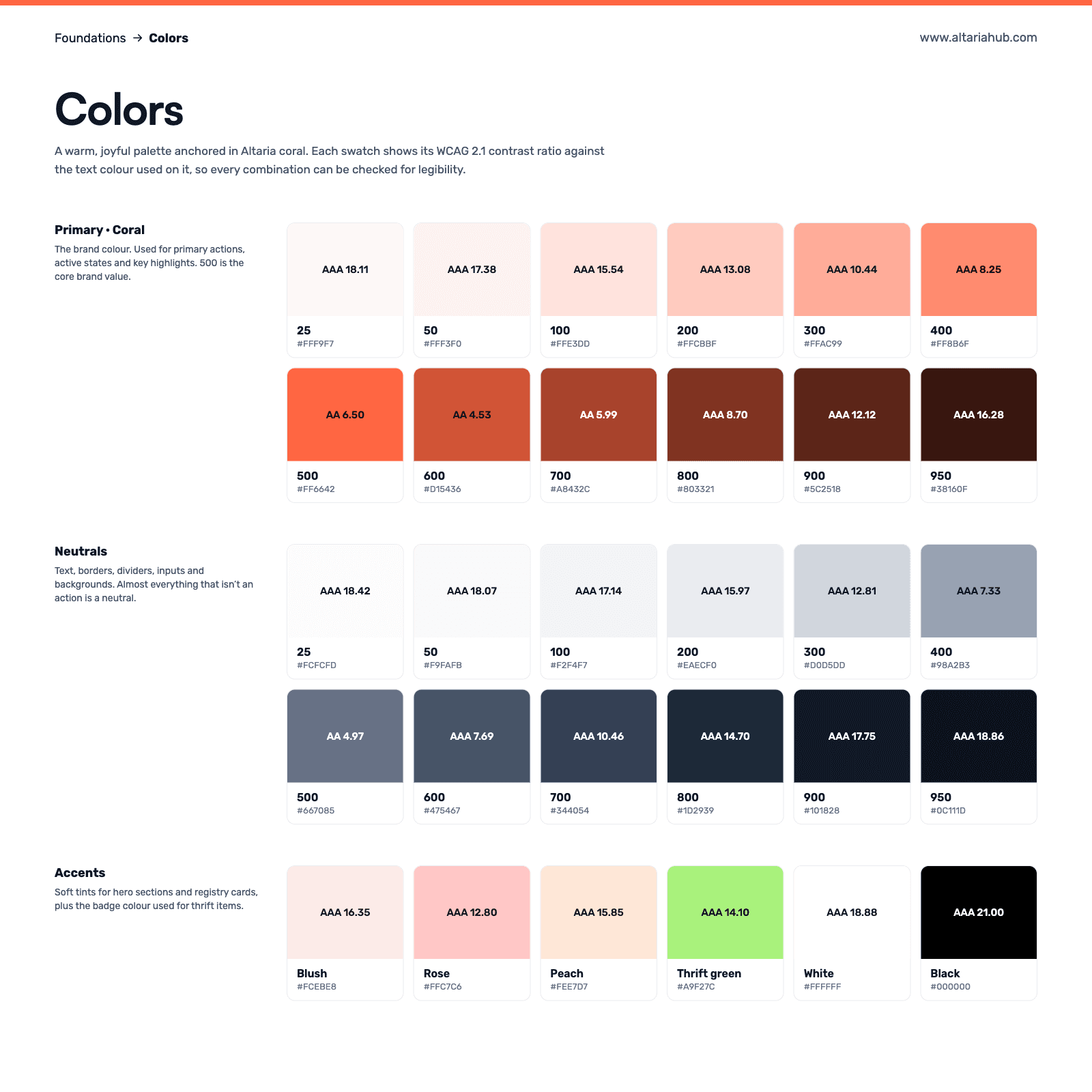
The visual direction needed to feel warm and joyful, like shopping for a child, while staying clear and trustworthy enough for parents to buy with confidence. I developed a fitting, high-contrast design system using orange as the primary color with rounded components to keep the tone friendly and approachable.

I built high-fidelity interactive prototypes in Figma for the four key journeys across web and mobile: discovery to delivery, registry creation to gift delivery, event discovery to RSVP, and vendor order fulfilment. The team reviewed each one internally, walking through every flow end to end to check that the dead ends, unclear next steps and small-screen issues from pre-launch testing had been resolved before handoff.
4 Journeys Prototyped 5 Surfaces Covered 0 Dead Ends left in Key Flows
"Every path leads somewhere. I didn't have to think at all - it just guided me through."
Iteration 1: Registries in the main navigation. Registries were tucked inside the account area, so many users never found them. I promoted Registries to the top navigation alongside Home and Shop. Result: one of Altaria's most distinctive features is now one click away from any page.
Iteration 2: Guest checkout for registries. Gift buyers were treated like regular shoppers and pushed toward creating an account. I added a guest checkout that opens straight from a shared registry. Result: friends and family can buy a gift in a few steps without signing up, removing the biggest barrier in the gift buyer's journey.


The final design, built around "Every Path Leads Somewhere," delivers one connected ecosystem where parents, vendors, riders and admins each get a focused experience, and no journey ends in a dead end. Key features include:
Stage-aware shopping with categories from newborn to teen, plus filters for subcategory, price and product condition, including thrift.
Guided registry creation that starts with the occasion (baby arrival, birthday, back-to-school) and tailors the template to fit.
Shareable public registries where guests see what's still needed and buy a gift without creating an account.
A mobile-first vendor dashboard for sales, products, orders and team permissions, with one-tap switching between shopping and selling.
Responsive web and a native mobile app, designed for the phones most parents shop on.


4
Key User Journeys Redesigned
2
App Designed from Scratch
4
User Roles Served
In marketplaces, the hardest problems live between users, not on screens.
A dead end is a broken promise. Testers didn't struggle with any single screen. They struggled when a flow stopped without telling them what came next, so designing the next step first changed everything else.
Every product has a second user. Registries looked like a parent feature, but the gift buyer was a completely different audience with different needs. Designing for them separately removed the biggest barrier in the journey.
Redesigns should start with an audit, not a blank canvas. Mapping what already existed, and where it broke, made it clear what to keep, what to fix and what to build new.
AI-assisted registries. Suggest items based on the occasion, the child's age and what similar families add, so parents can build a complete registry in minutes instead of searching item by item.
Group gifting on registries. Let several guests chip in toward one big item, like a stroller or a car seat, instead of everyone buying small gifts.
Booking calendars for service vendors. Let photographers, party planners and other providers show their availability and take bookings directly.

